Instructions

Grid System

Use this Grid for creating new layouts. You can combine this percentages with each other for creating uniq layouts.

Almost all layouts have one HTML structure:
Section ↴
Container ↴
Grid ↴
Grid Item


Grid Item can be different widths.

20%

25%

33%

50%
67%
80%
100%

Common Grid Layouts

Structure of the Grid System:

Parent div block with class "Grid"
Children blocks with class "Grid Item". Each of this classes has predefine combo classes with percentage: 20, 25, 33, 50, 67, 80 and 100.

Main principle of this Grid is wrapping Grid Item to next line when it fills 100%. So, you can have in one line different combo layouts like: 50:50, 25:25:25:25, 33:33:33 etc.

For mobile breakpoints, you could add a specific combo class to Grid Item for 100% width. For example, You have a 33% "Grid Item" and for the Tablet view, you want to show this element in 100%. You could add combo class "Tablet 100" to do this.

If you struggling with combo classes you can read more about it.

20%
80%
100%
33%
33%
33%
33%
67%
80%
20%
25%
25%
25%
25%

Spacers System

Use this additional spaces if needed.
You can easily choose predefined space just input combo class that you need or create your own.

8px

12px
16px
20px
24px
32px
40px
48px
56px
64px
72px
80px
88px
96px
112px
128px
184px

SVG’s Code Icons

1. Embed Element

User interface showing component options including Background Video, Dropdown, Embed, Lightbox, Navbar, Search, Slider, Tabs, and Map, with a red arrow pointing to the Embed button.
All icons in this template insert like SVG code via the "embed" element.

This is done so that you can easily control the color of the icon, and change it on hover

2. How it Works

User interface panel titled Specialist Arrow Styles showing size settings with width and height both set to 12 pixels.
You can easily copy & paste these icons and change it size via "Size" panel
UI panel showing typography settings with Inter font, normal weight 400, size 14 px, height 1.5, brand secondary color selected, text alignment options, and style options including italicize and decoration.
Change color (In the Typography section)
User interface panel showing typography settings for a slider arrow with font Lexend, weight 300 Light, size 14 px, height 1.5, and color Brand Primary selected.
Control color on Hover State

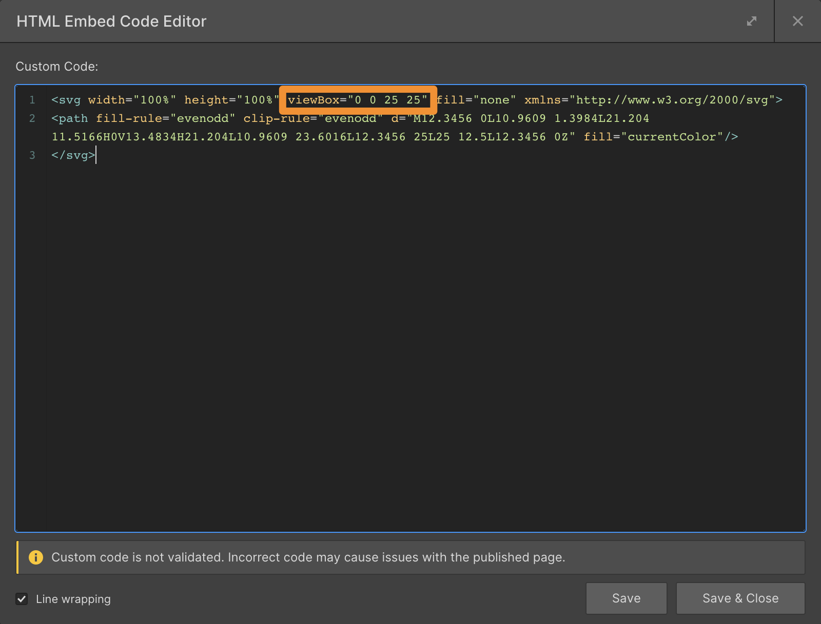
3. Anatomy of SVG Code

Screenshot of an HTML Embed Code Editor showing SVG code with width and height set to 100%.
Size of the icon. Better to use in "%" and final size control via Webflow "Size" panel
Screenshot of an HTML Embed Code Editor window showing SVG code with a viewBox attribute highlighted in orange.
This is a bounding box of icon.
Screenshot of HTML Embed Code Editor showing custom SVG path code with fill-rule and clip-rule set to evenodd.
Content of icon. How it will look like
Screenshot of an HTML Embed Code Editor showing SVG code with a highlighted fill attribute set to currentColor.
If you want to control color via Webflow panel in the Typography section you should write in "fill" parameter property "currentColor"

4. Thats it

Hope these steps help you to use this technic to create or control your own icons.

And last but not least

SVG code you can grab almost in any graphic editor.

Context menu in a design tool with 'Copy/Paste as' submenu expanded and 'Copy as SVG' option highlighted, showing a selected brown arrow shape on a grid background.
For example in Figma you can simple click on SVG icon right button of the mouse and find "copy as SVG" command.

Customizable to suit your brand

Feel like changing something in the template? All of our templates where built using Webflow without writing code. That means you can customize them in every way to suit your brand. Learn more about how to customize Webflow sites at Help Center